EA1 Vehicle Service
The client for this application approached me because they were looking to create a product that allows drivers to quickly connect with mechanics when dealing with car problems. They also were loooking to enable hobbyist and mechanics unassociated with any particular shop the opportunity to gig-work and manage their own time.
I was able to effectively create user personas, competitive audits, sketches, wireframes and a final prototype and send over final assets to an engineer in around three months.
My Role
As the sole designer, I was able to work on all stages of the design including: User Research, Sketching, Journey Maps, Low and High Fidelity Designs.
Team
I collaborated with an engineer and a business lead to help facilitate the needs of our client and determine scope.
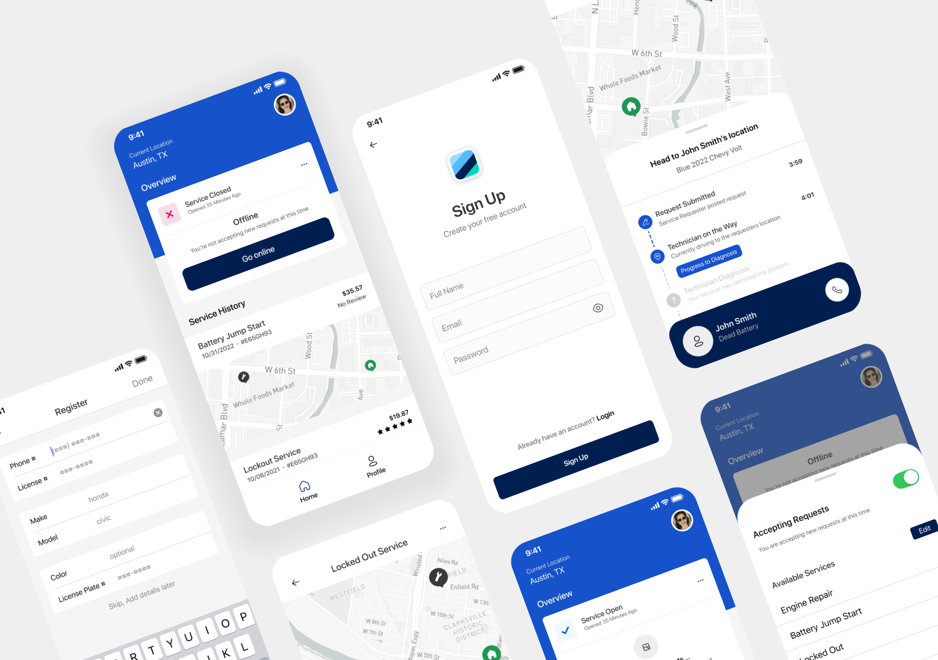
Final Prototype of EA1, a service that allows users to request help when experiencing vehicle problems
User Personas
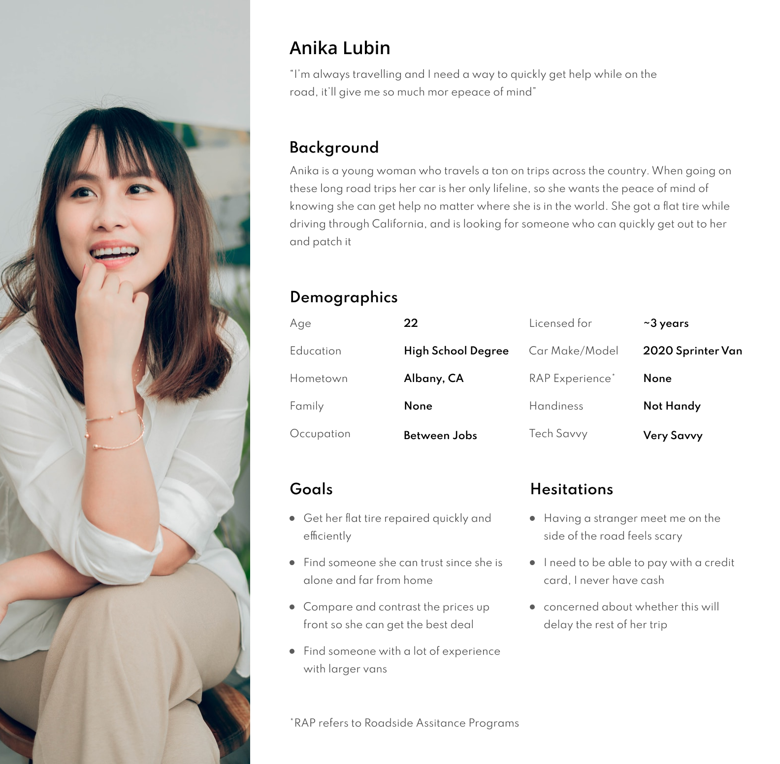
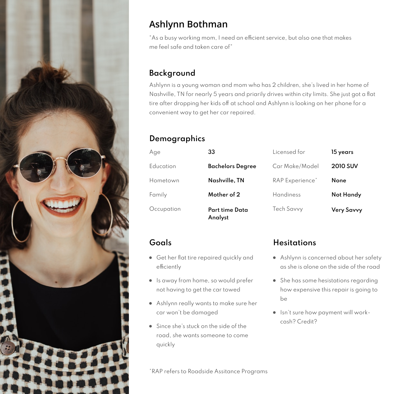
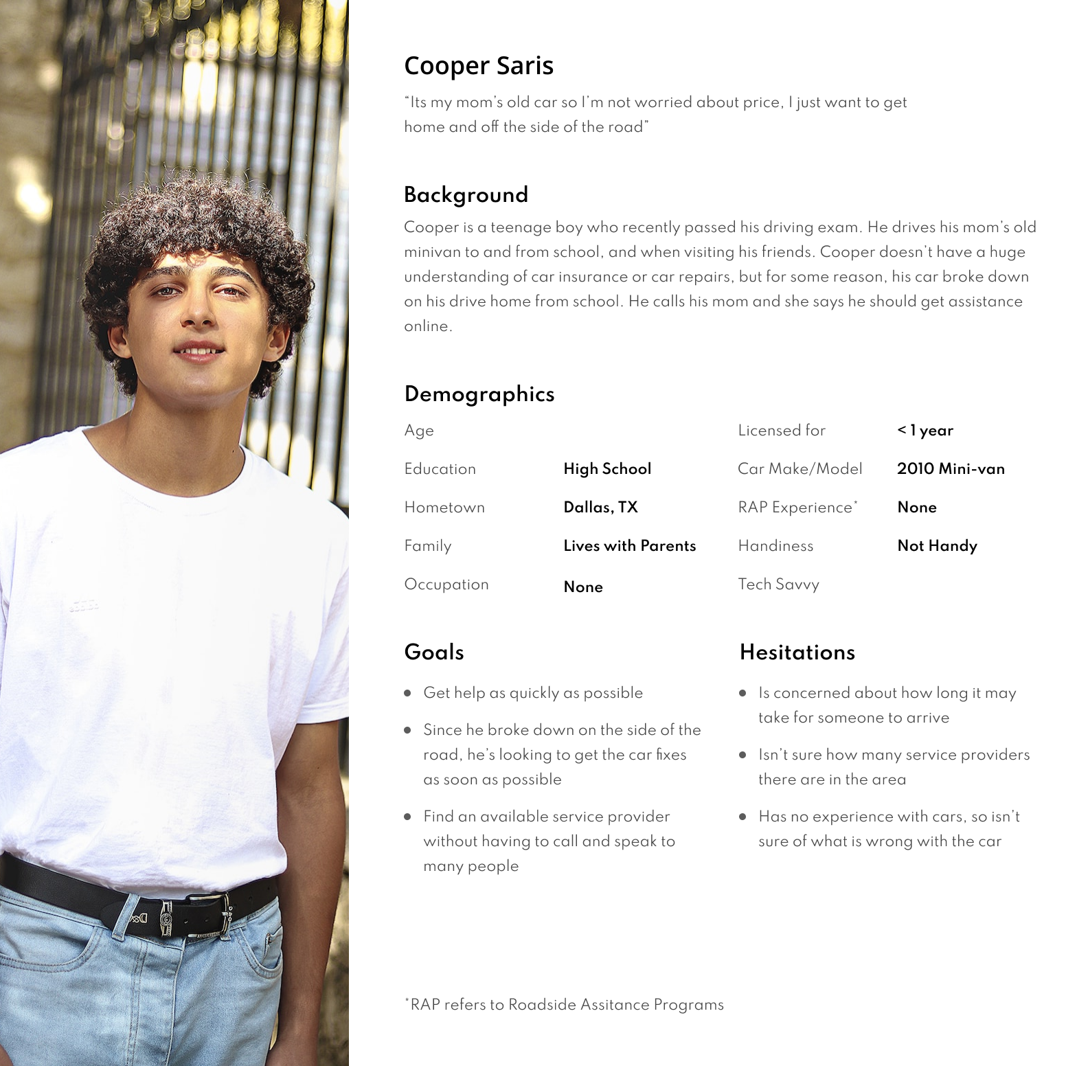
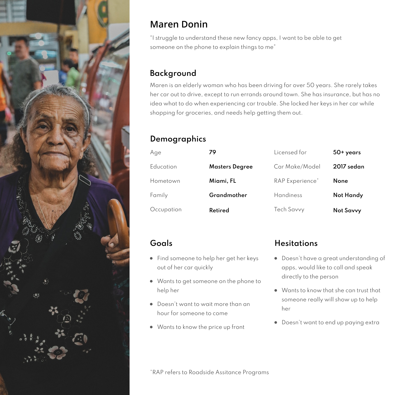
I chose to create user personas first, as I wanted a high level understanding of some of the reasons different users would use the app as well as some of the hestitations that could prevent a user from using ours.
To ensure inclusivity and edge case users, I created many user personas to represent all of the different user groups that this app will be targeting. A few of the key areas included were: diversity in age groups, potential disabilities, exposure to technology, experience with car engines, as well as distance from major cities.
Competitive Audit
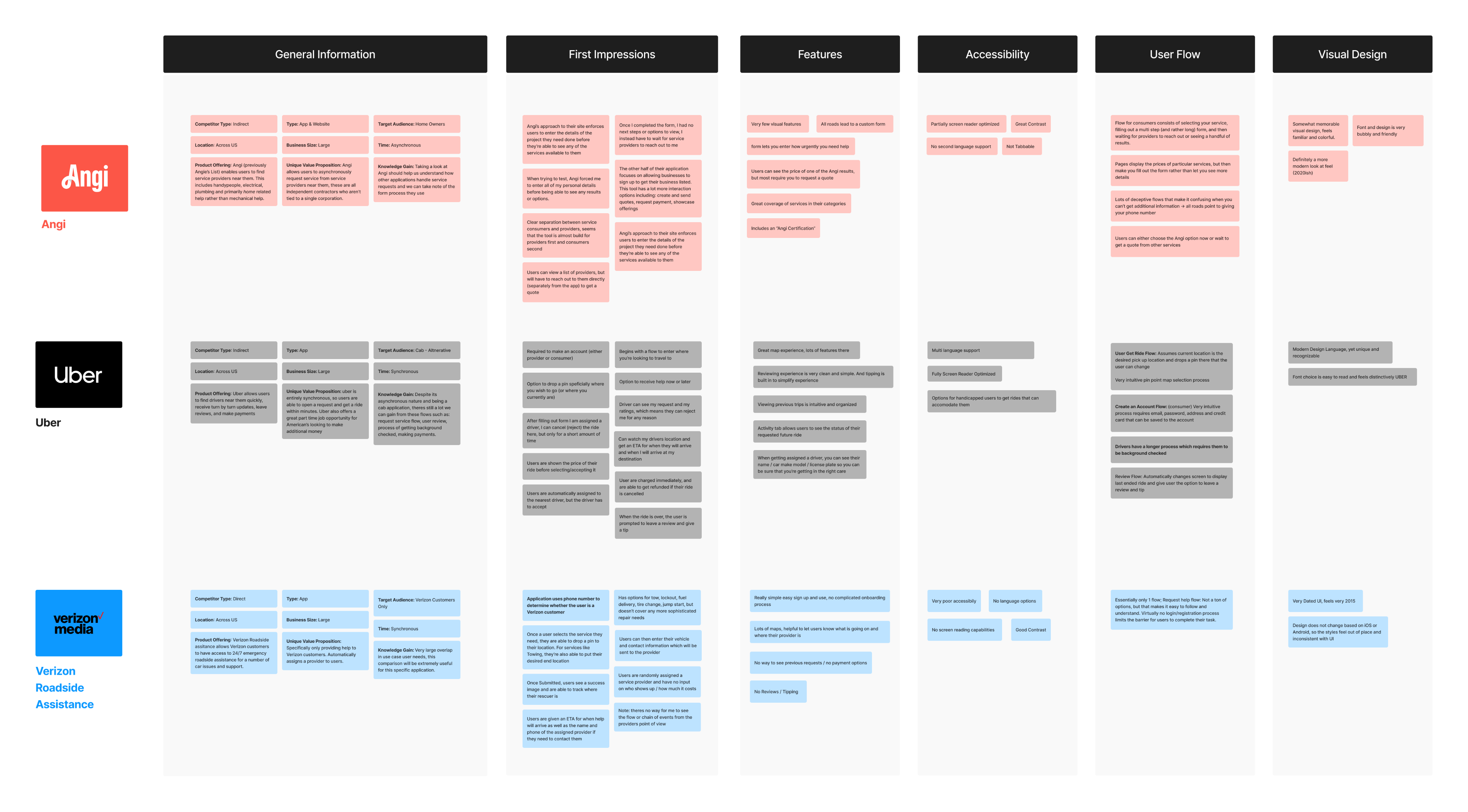
Following Personas, I decided to do a competitive audit on the similar B2C products in the market. To get the most useful insights, I decided to only focus on applications that were directly available to a broad market, which removes applications like State farm roadside assistance or any other insurance-associated service provider.
I specifically chose Angi, because they have a unique gig-work structure that would help me to understand common design standards that allow service providers to showcase their services and get connected with customers. Uber felt like an obvious choice as they handle complicated location tracking and connect drivers and riders in a similar way that we will connect service providers and requesters.Lastly, I chose to audit verizon media assistance, because I wanted to have a roadside assistance specific company to research.
Pain Points Found
Following the creation of user journey maps a handful of pain points were discovered, many of which were already being address by competitors. A handful of these problems were being addressed which were what I really wanted to spend time ideating and designing solutions for.
Handling Volume
Many applications (Uber, etc) only enable users to have one connection at a time, but in the auto industry users are going to want to compare rates and eta's accross different providers.
Price
Most applications like State Farm and Verizon roadside assitance will often bundle these services into their month to month rate, but since this app will be separate from those providers we'll need to handle cost in a transparent way
Safety
Many users may be alone or in an unsafe location when they are having car trouble, its important that the person going to assist them is trustworthy and knowlegable
Accessibility
Accounting for users who are have speciific special-needs will be important in the applications design, as a user who is hard of hearing for example would need very different accomodations than someone who is in a wheelchair.
User Flow
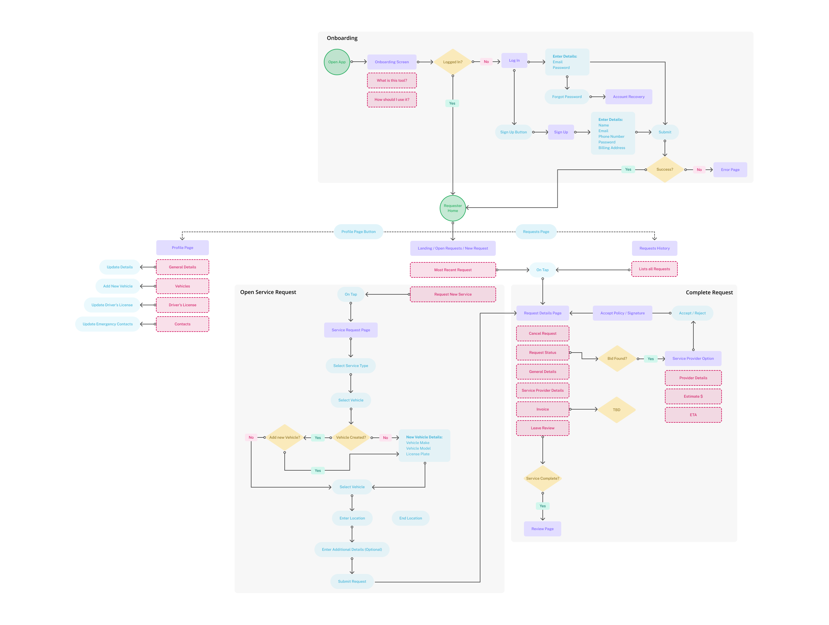
After a few iterations of design thinking and exploration, I was able to create a user-flow site map that scopes out the necessary screens and expected interactions across the app.
This layout really helps me look at the structure logically so we can catch any mismatches or miscommunications early. It also helps me to bring up business or technical challenges early on, so we can address for them now, instead of when the designs are in their final stages.
Low Fidelity - Design Decisions
First approach at the structure of the application, lots of iteration and design thinking used here.
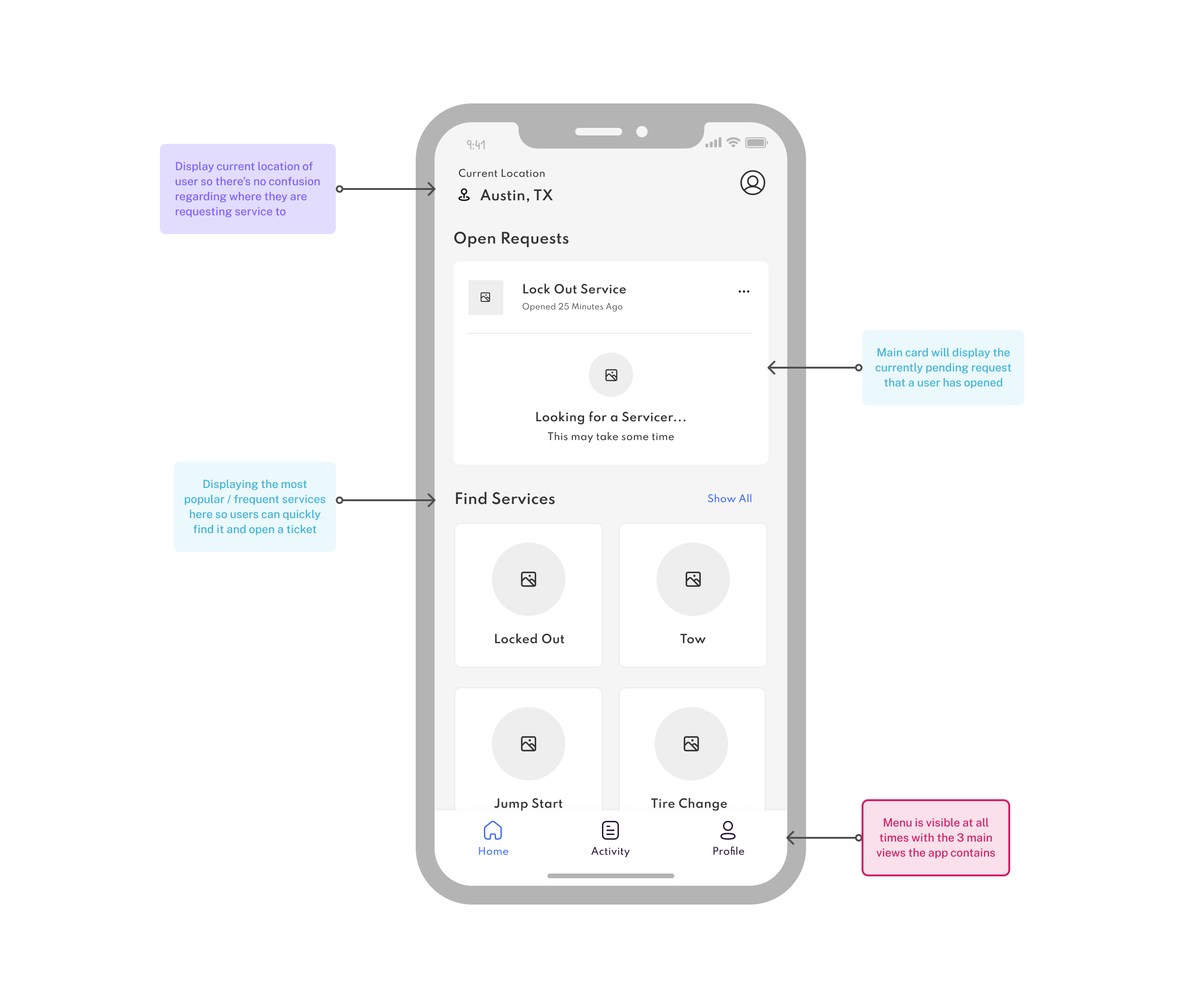
Landing page that displays once a user has logged in

Service Provider Choice View
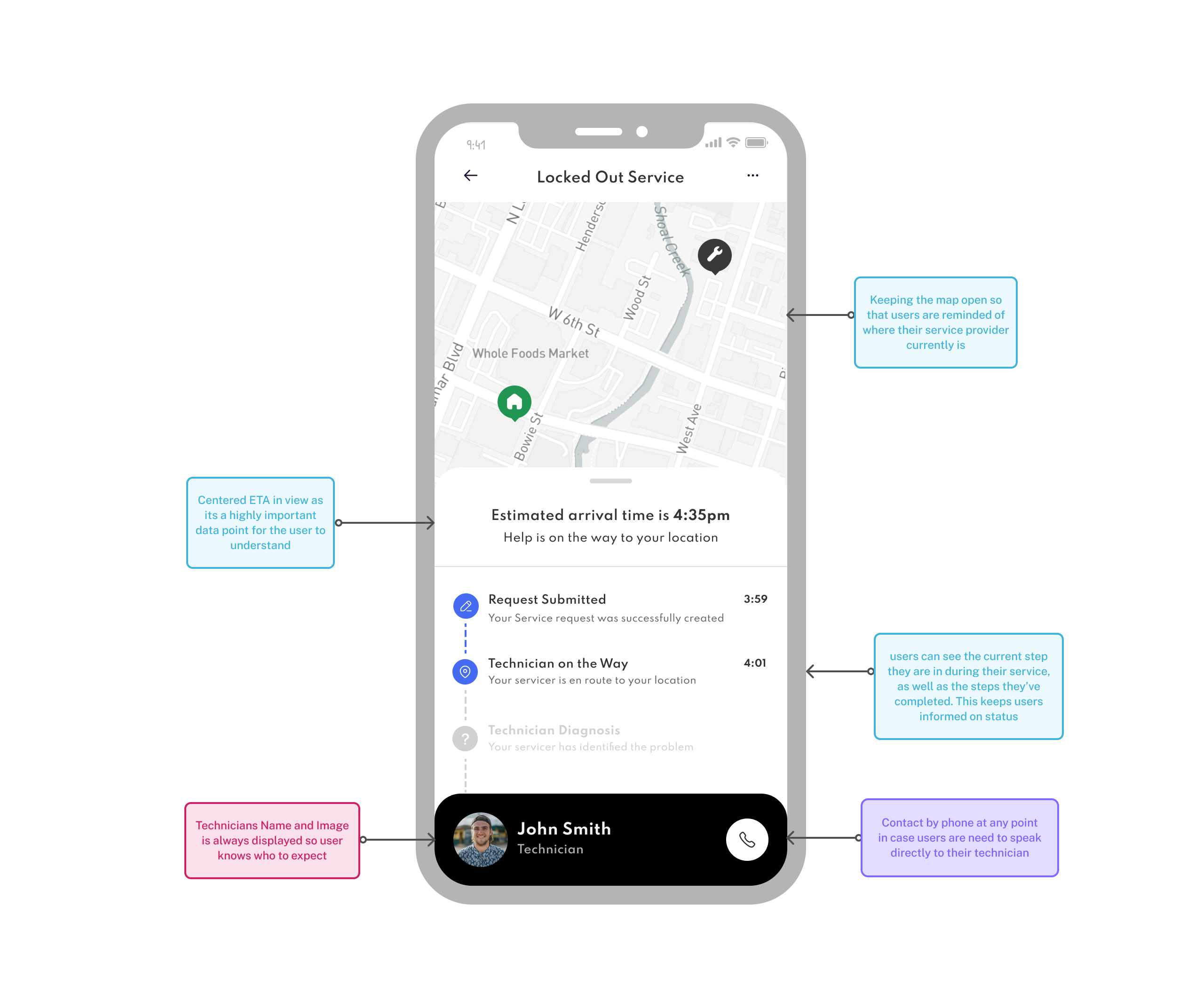
Service Request In Progress Page
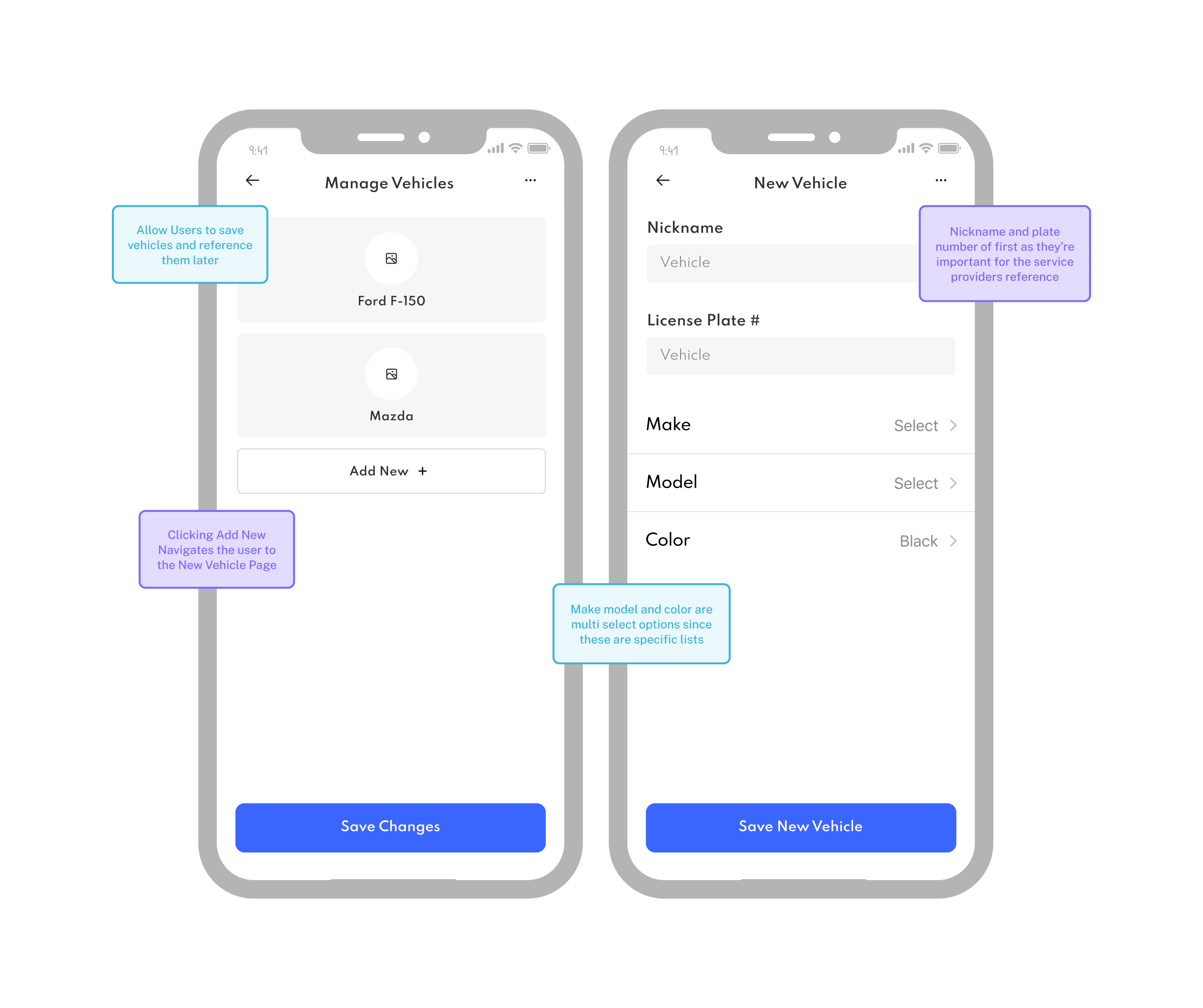
View when adding your vehicle to your service request
Visual Design
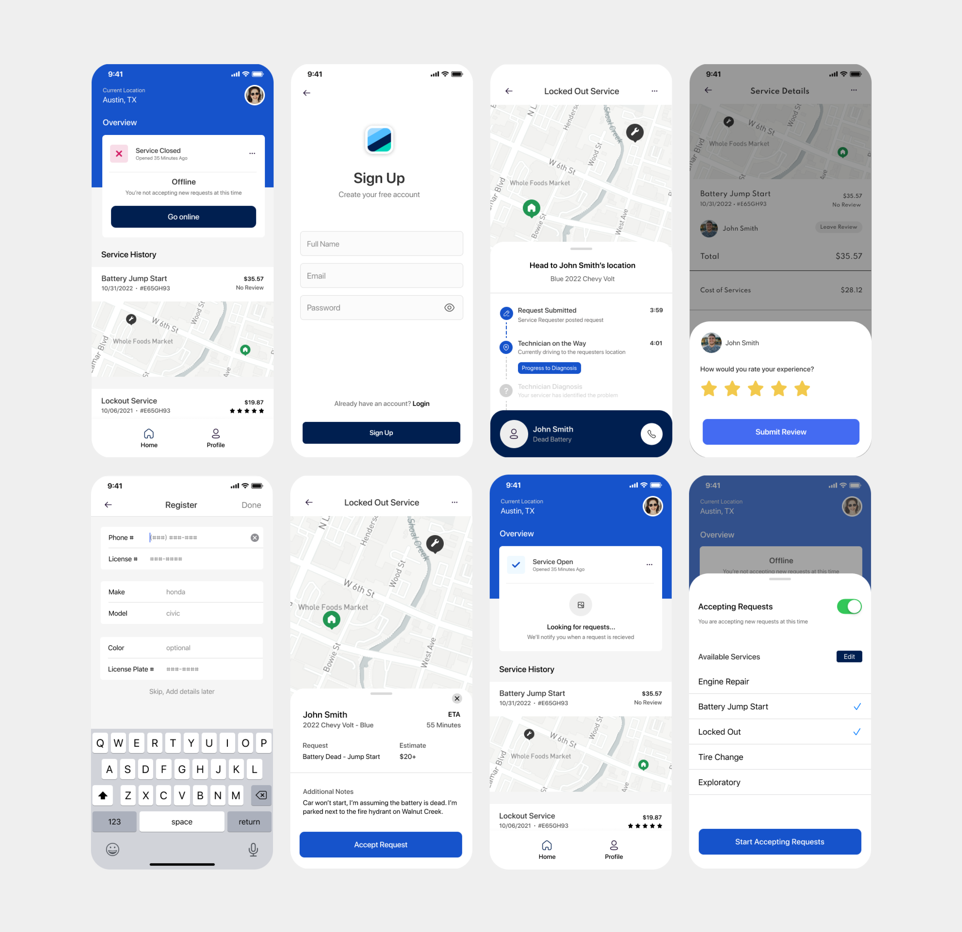
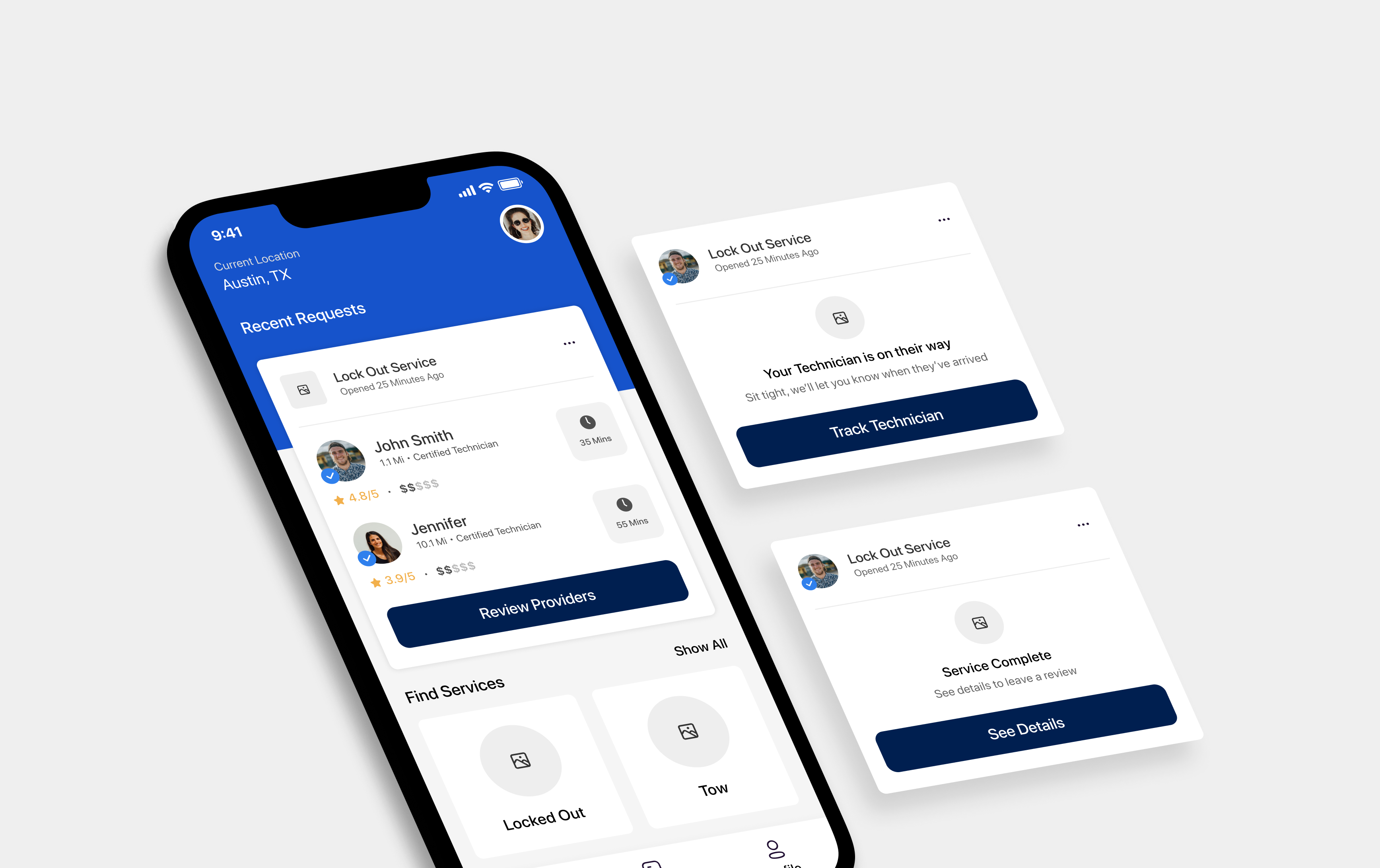
After some feedback and reviews, I went back through each of the views to update the UI to reflect the visual design and look at feel that the client wanted to go with.
Challenges
The biggest challenge with this appication was the ambiguity of the requirements. I'm used to working with clients who are highly opinionated, but this client was truly open to anything. This made it tricky to get an established sense of which direction the application should go in. This ended up being a great personal challenge, as I was able to add more input in the direction of the product and company as a whole which challenged the way I approach design thinking.