Movie Theater Case Study
Throughout my life I've been to the movie theater countless times. Originally, the only option to buy tickets was in person at the ticket stand, but with the popularity of the internet and mobile phones, purchasing tickets online has enabled all of us to have even more control over our movie theater experience, including selecting our seats.
I've found a lot of these seat selection applications extremely unintuitive and frustrating to use, so I wanted to do a full case study to identify common pain points, and address potential solutions.
Design Process
I used a 5-stage Design Thinking model proposed by the Hasso Plattner Institute of Design at Stanford
My Role
As the sole designer, I was able to work on all stages of the design including: User Research, Sketching, Journey Maps, Low and High Fidelity Designs
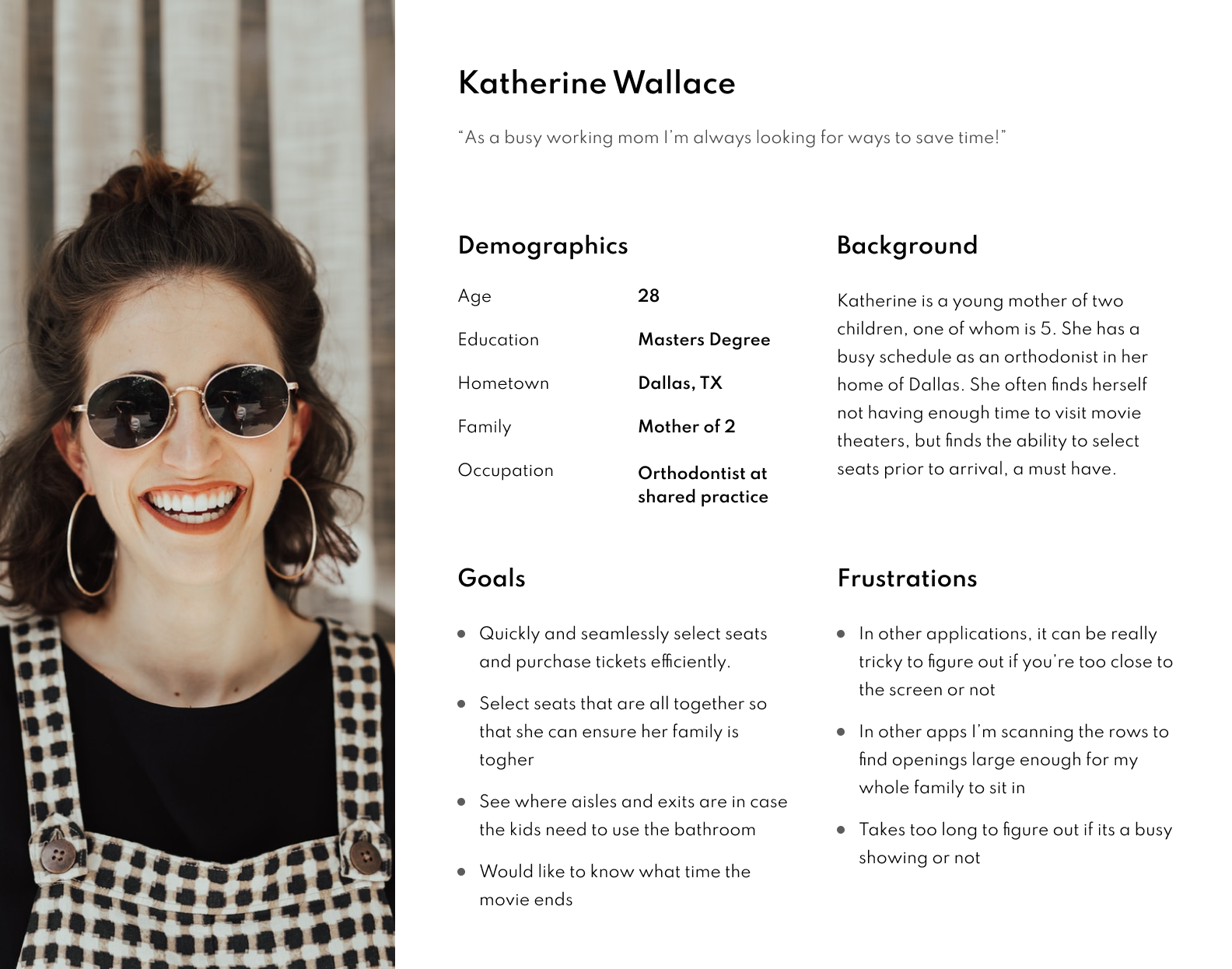
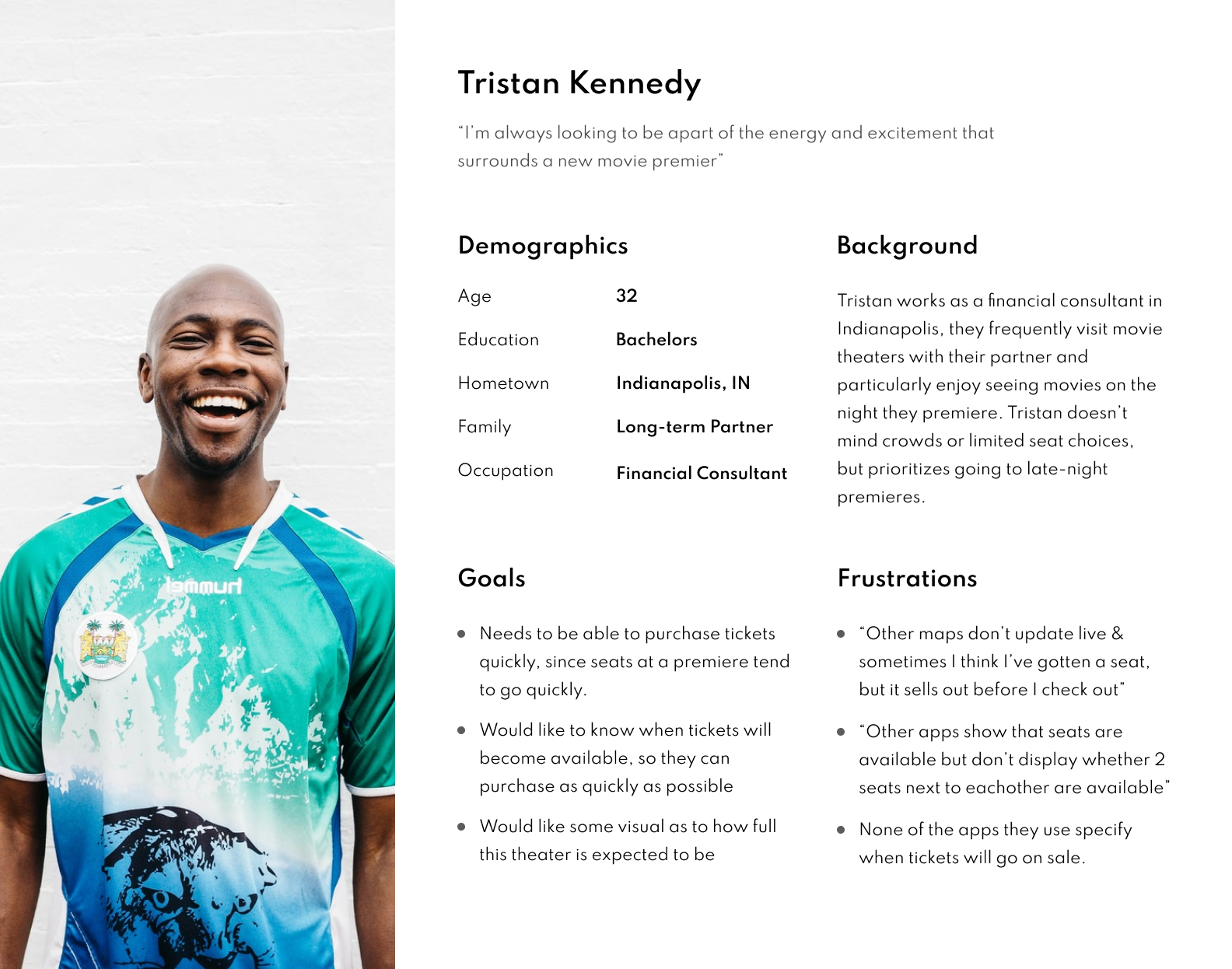
User Personas
To ensure inclusivity and edge case users, I created a handful of user personas to represent many of the different user groups that this app will be targeting
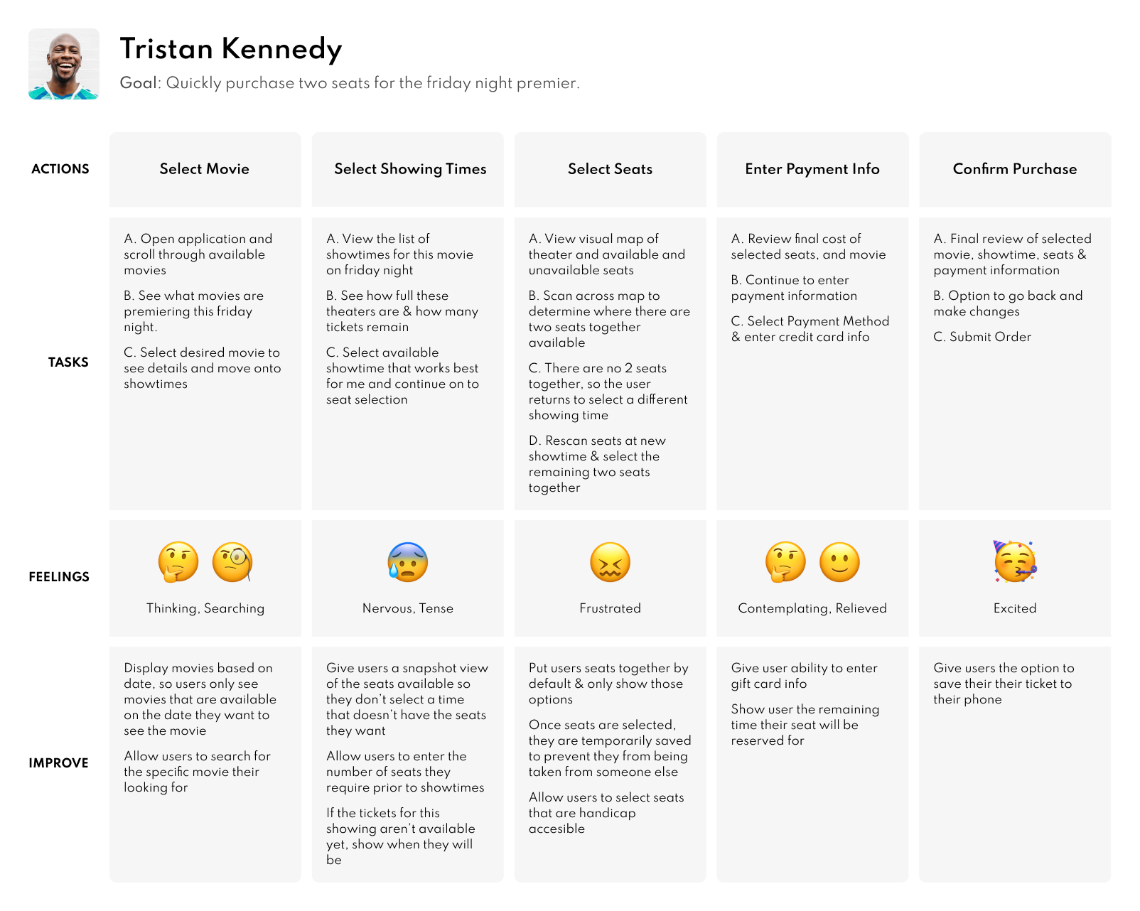
User Journey Map
Each of the user personas were then taken through the existing user experience journey within many of the popular movie theater applications found today. This helped to begin establishing pain points and better empathize with users at each step of the application.
Pain Points
Following the creation of user journey maps and storyboarding a handful of pain points were established a select few were chosen to be the primary focus due to their high feasibility and importance
Just Browsing
Many users are in the mood to see a movie on a particular day, but aren't sure which movie they want to see. This makes many of the flows frustrating, as users can't see the availability of a theater until after they select a movie.
Good Seats
Many theaters will advertise having seats available for a showing, but they include the front row seats, which a large majority of viewers avoid. This leaves users feeling mislead.
Large Groups
I found that every application handled groups differently. Some apps made assumptions about the needs of the user by forcing all of the seats to be in a row together. Other apps ignored the grouping of users, and as a result, users were given showings that wouldn't work for their large group
Accessibility
A large amount of information necessary for those with disabilities is often not included on these apps and requires a phone call. Information such as, elevator locations, accessible seating, availability of assistive listening devices, sign language interpreters, etc.
Sketching and Ideation
To begin addressing these pain points, I created 6 digital sketches for each of the main screens that would be necessary: Landing page, movie details, and seat selection. These sketches helped me come up with ideas for flows as well as create a logical informational hierarchy.
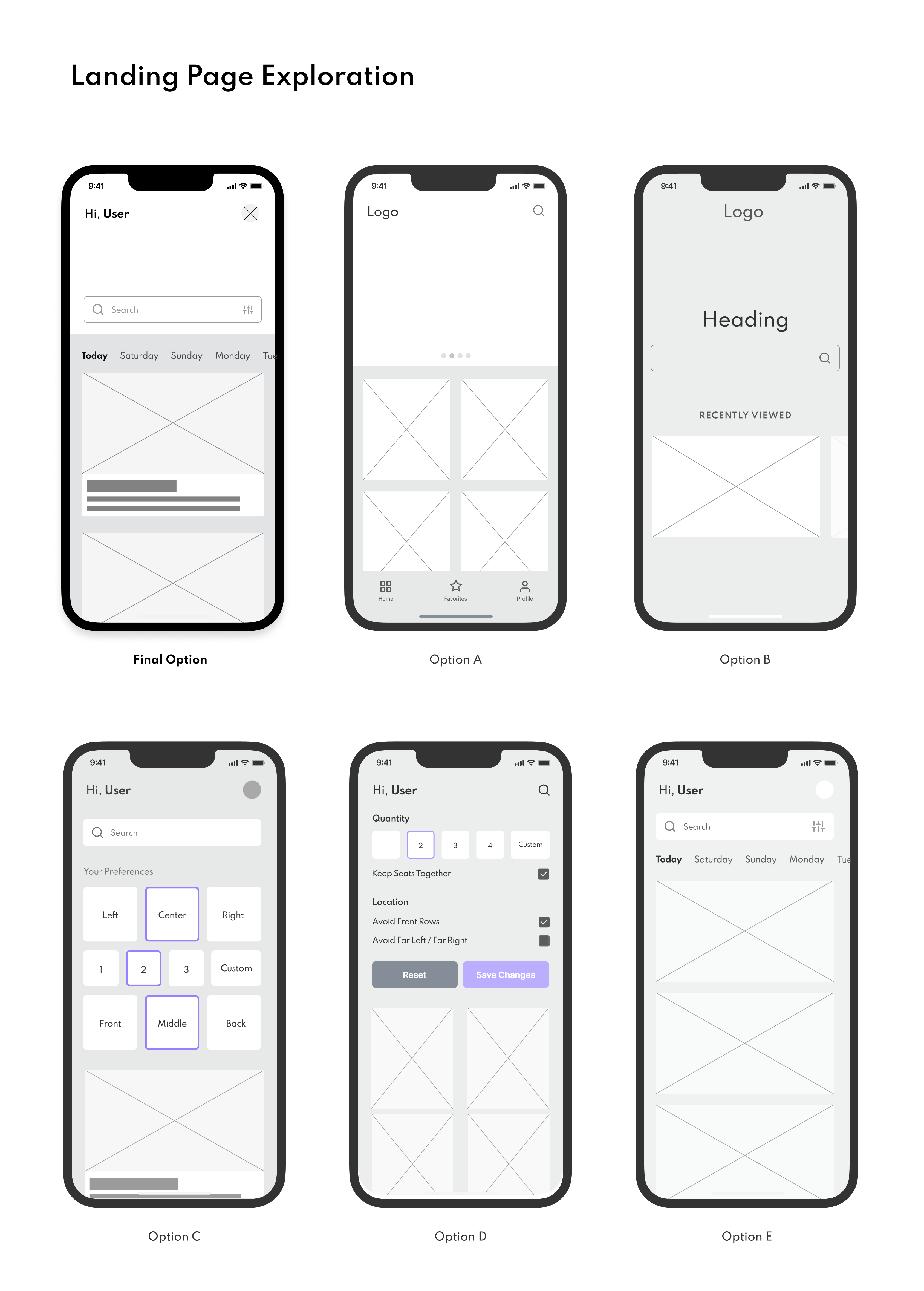
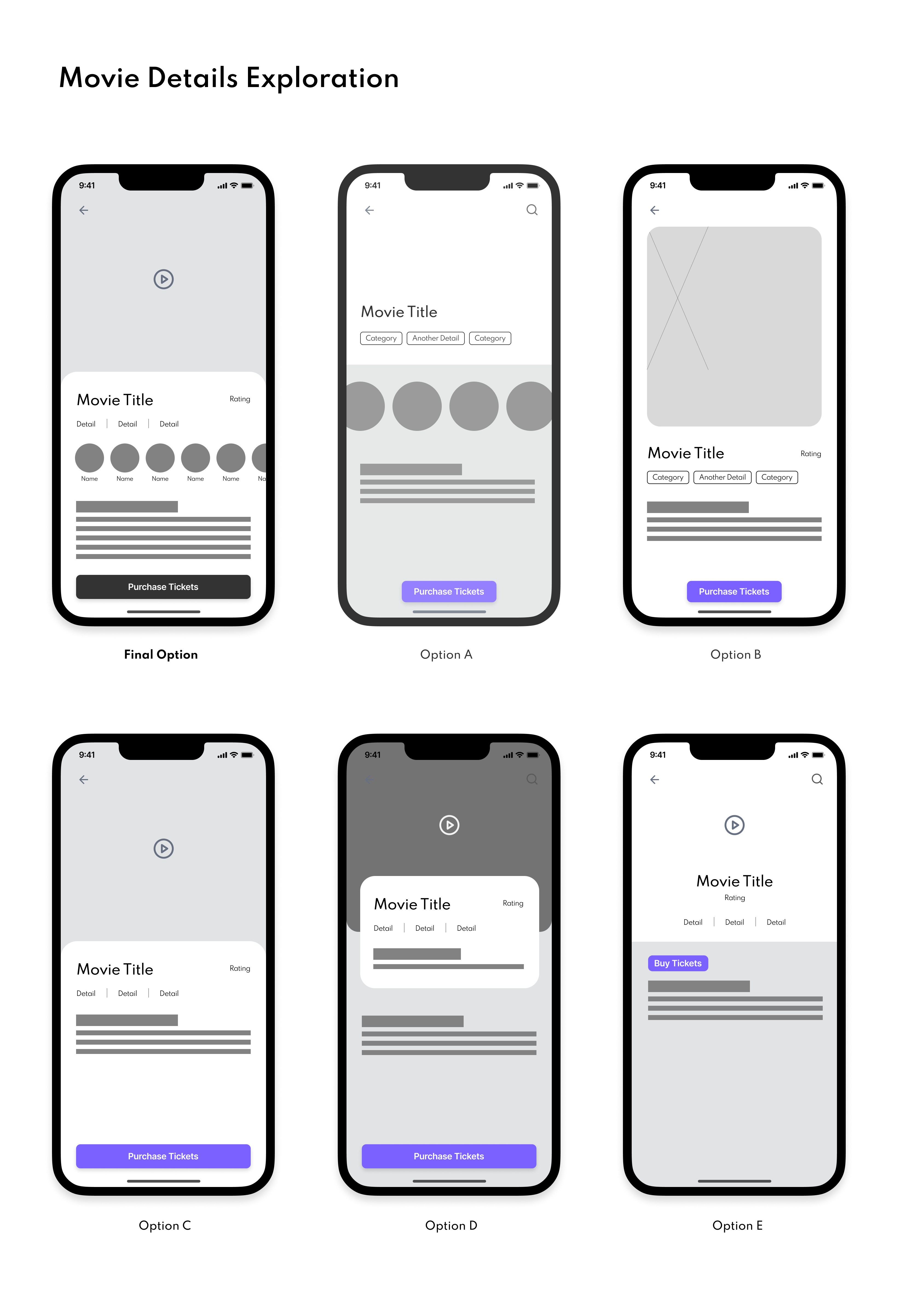
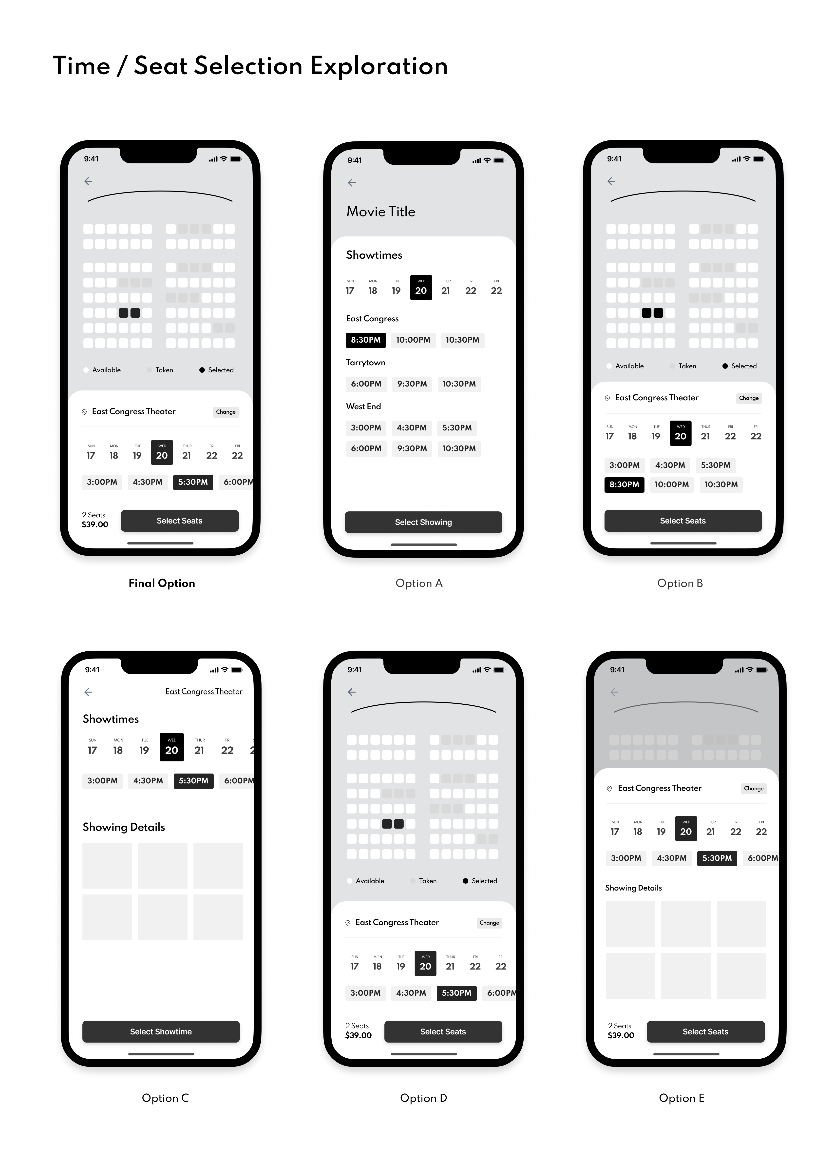
Establishing User Flow
Once my low fidelity wireframes were complete, I created additional screens to handle scroll events, filters, and searching so that I had a fully clickable prototype.
User Testing
We’re looking to determine whether the main user flows that enable selecting a movie, date, time slot and seat are easy for users to complete. We’re also looking to identify pain-points and challenges that could be impacting user retention and drop-off.
Research Questions
- Are there areas in the flow where users get stuck?
- Do users find the application easy or difficult to use?
- Are there features that the user seems to think are missing?
- What are the stopping points in the application?
Participants Must
- Have an awareness of movie theater ticket applications
- Be somewhat tech literate (has used a smartphone before)
- Two males, two females, and one nonbinary between the ages of 18 and 70
- One user who requires as assitive device (screen reader, etc)
Methodology
Unmoderated usability study
Location: United States, Remote
Date: Interviews will take place in the next few weeks
Length: Sessions are not expected to last more than ~10 minutes
Synthesizing Research Into Insights
Comments, Questions and Answers were added as sticky notes and then categorized to establish common themes and recognize patterns.
Changes Implemented from Research
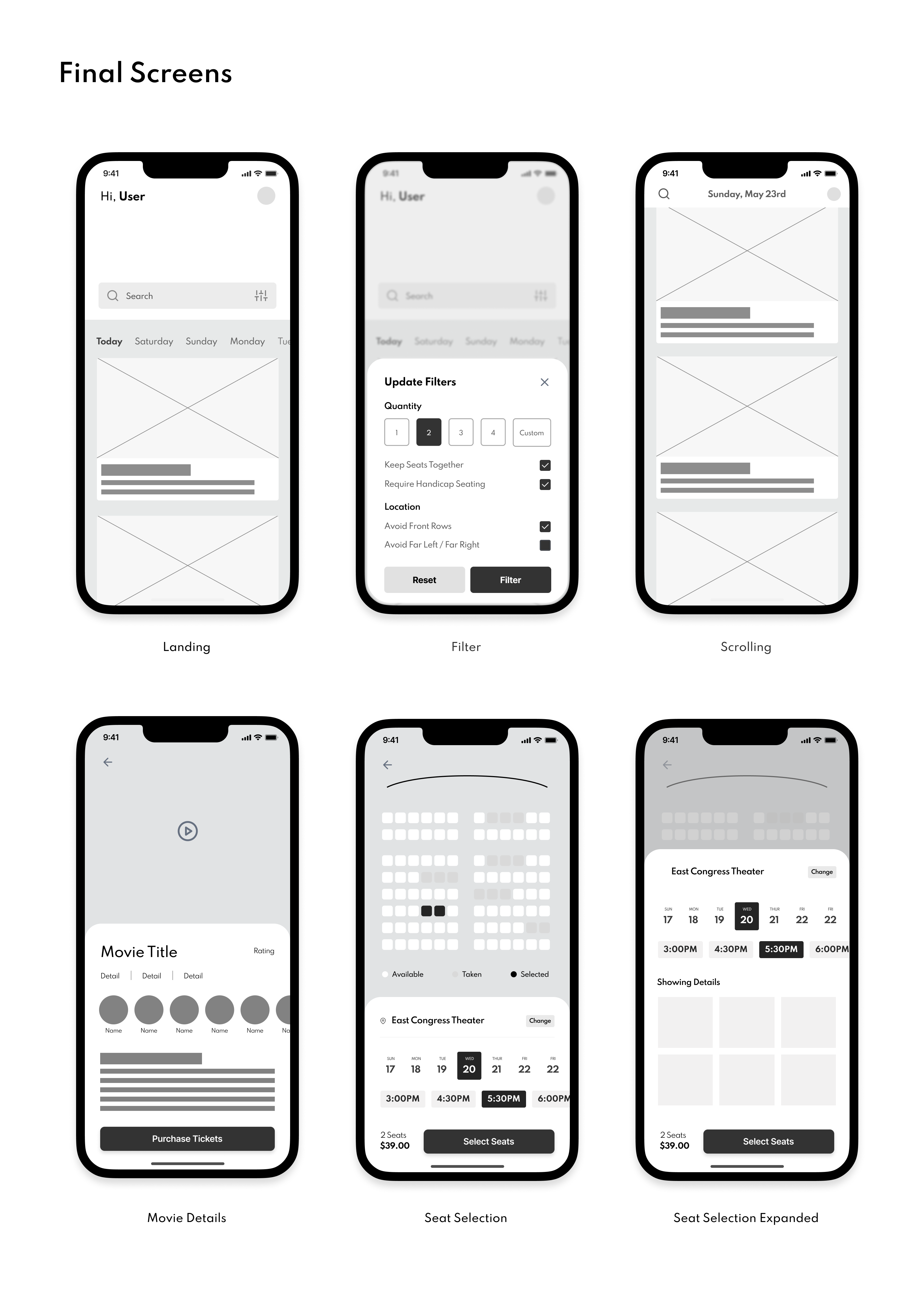
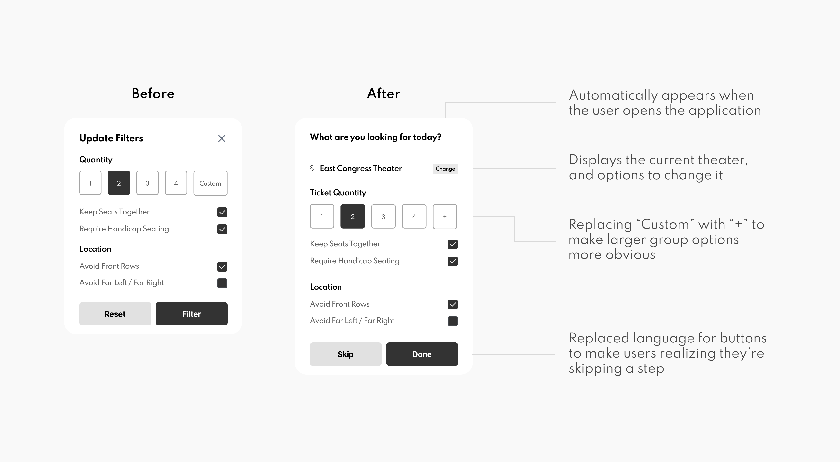
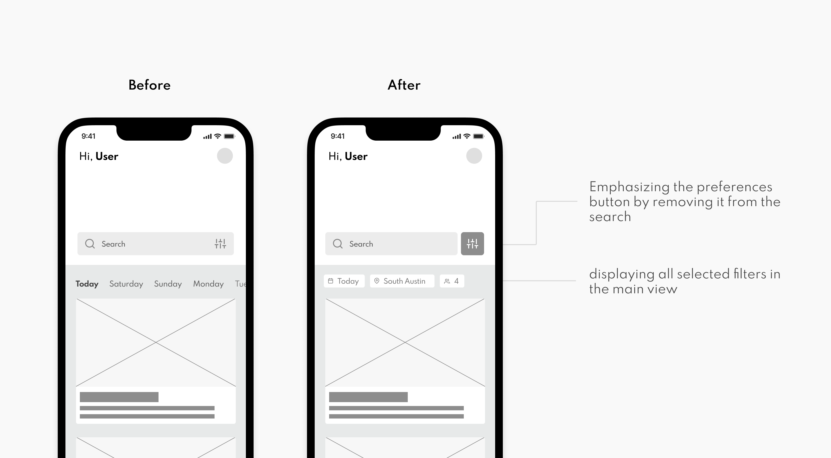
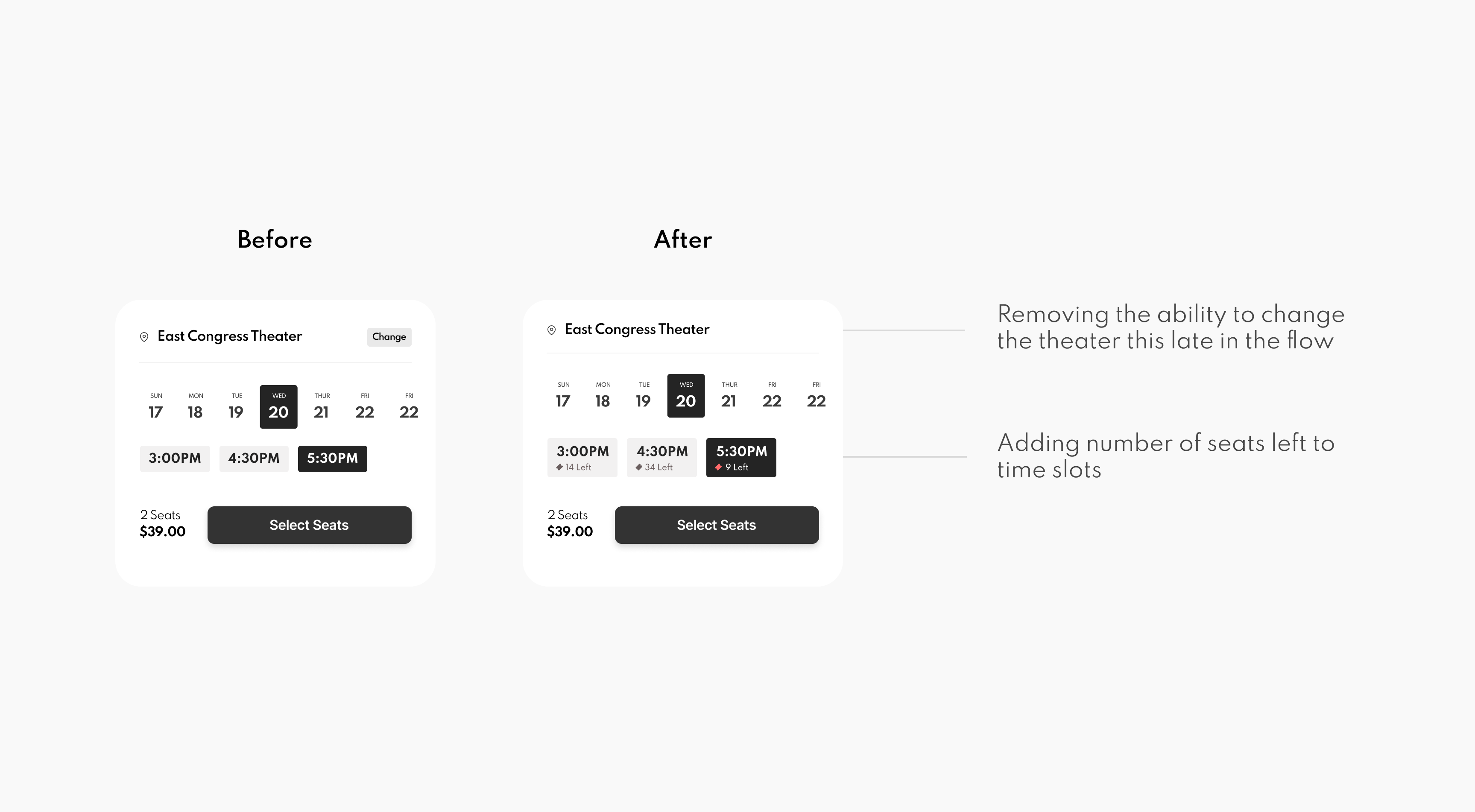
From our research, we gathered that there were 3 primary pain points that were complicating the flow for users. The first related to filters, In general, the implementation of filters isn’t super clear as to what it does and when it needs to be used. Second, was the issue of traffic/busy-ness, Users care about how busy theaters are, and its taking too many clicks for them to get this information. And lastly, users were left in the dark with theater selection, and in many cases were unable to identify that they even had the option to change theaters.
We made a series of changes to address these pain points:
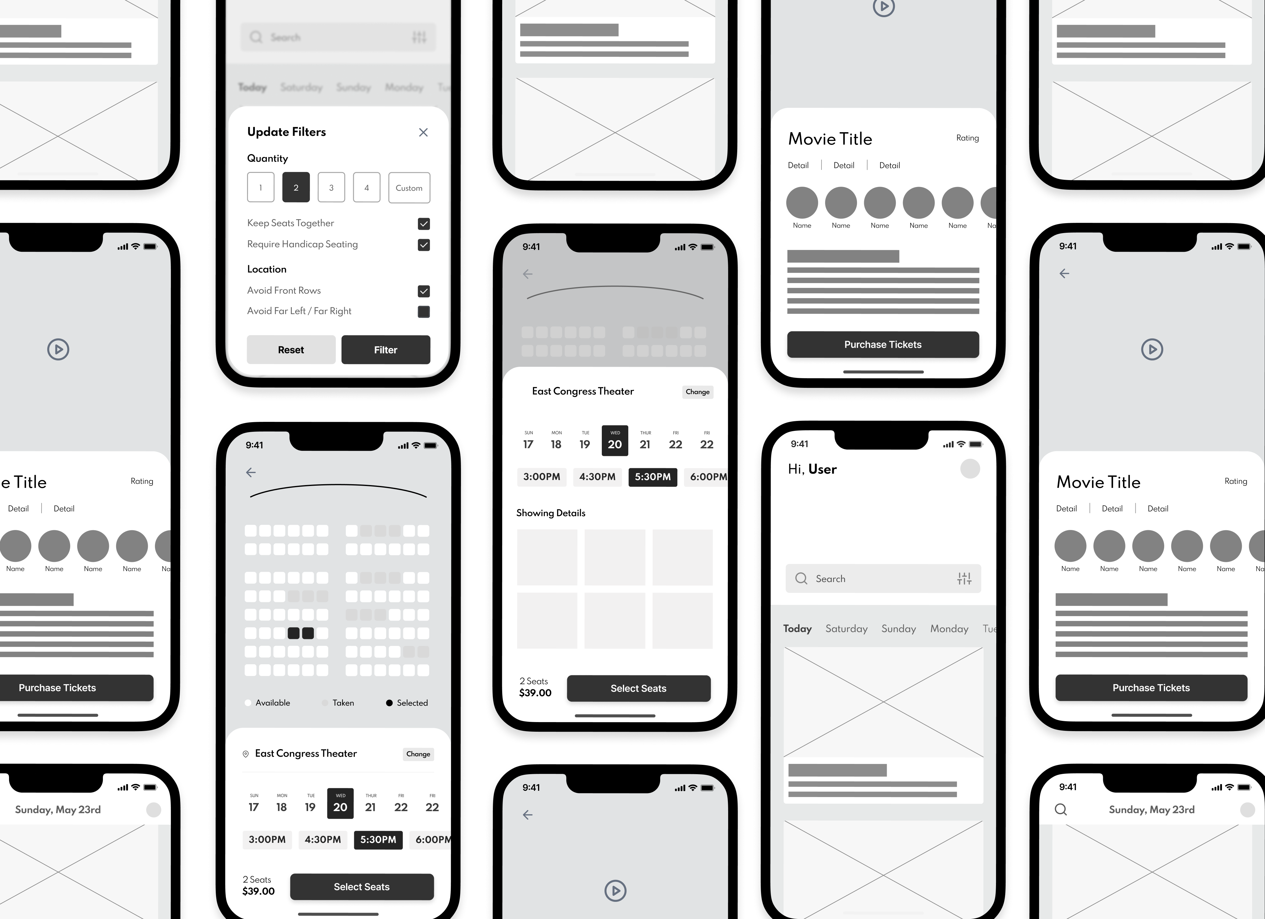
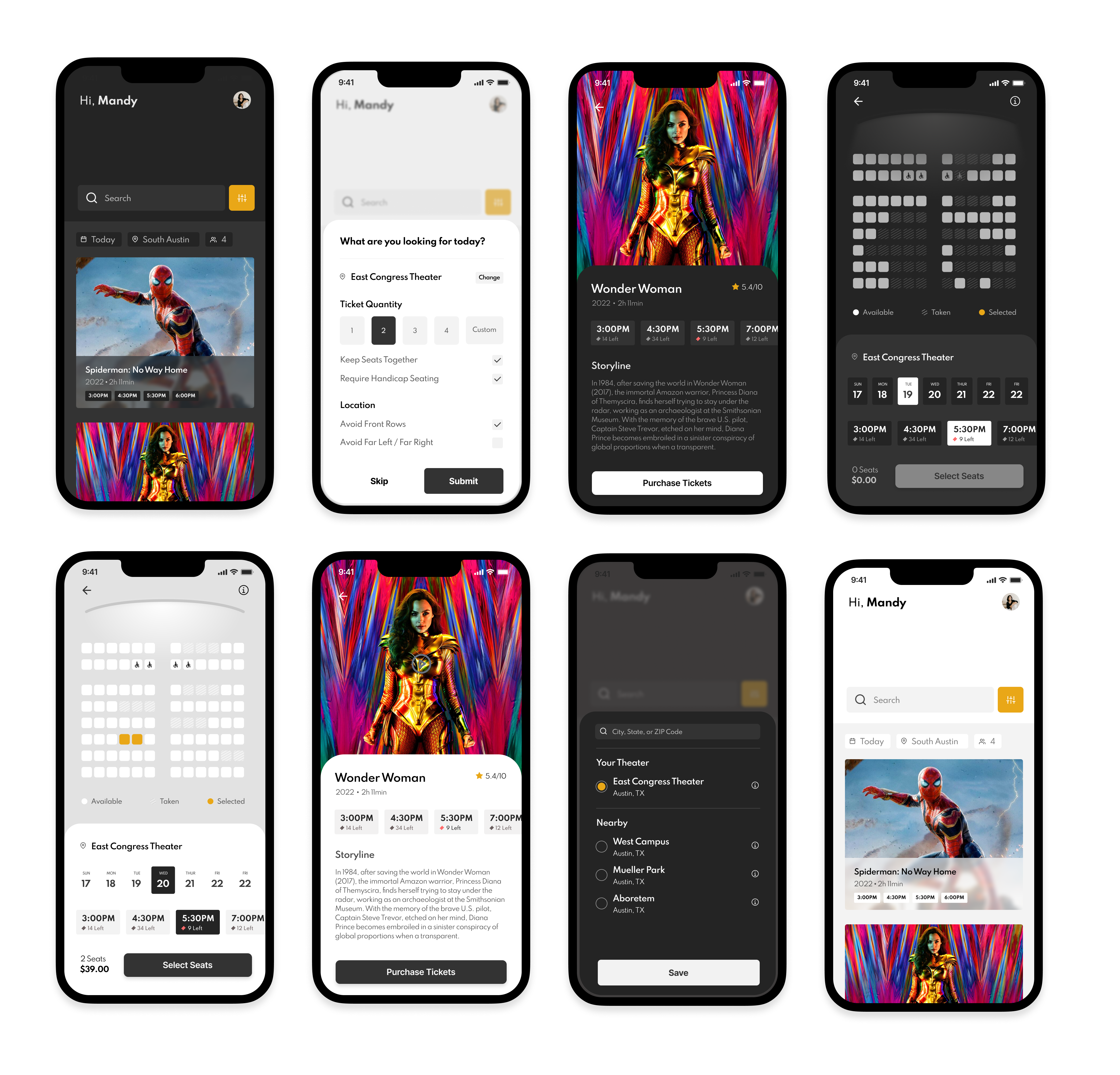
Final High Fidelity Wireframes
Finally, after spending some time finding and establishing a visual style for the application, I created the final high fidelity designs.
Lessons Learned
This case study really helped me solidify the importance of user testing at the low fidelity stage. I got so caught up solving the original pain points that were found that I ended up creating new ones! User testing helped me take a step back and readdress the overall goal of the application and helped to identify many new paints points as well.
Next Steps
If I were to continue building out and improving this project, I would do another round of usability testing to ensure that the original paint points were accurately addressed. Once solidified, I would create a site map and design guide to help developers transition my designs into code.